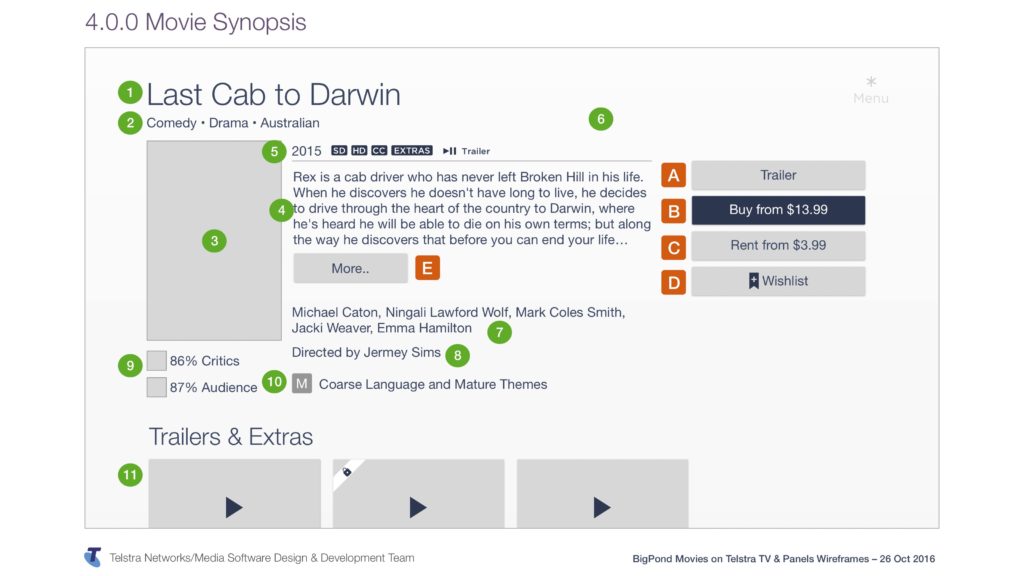
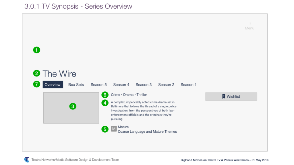
The project was to launch the Telstra TV set top box, and deliver the BigPond Movies application on this new device.
The highlight for me was the BigPond Movies on Telstra TV app scoring 8.4 on the Likelihood To Recommend metric (with a target of 7.3) and the Telstra TV scoring 78.8 on the System Usability Scale (SUS, with a target of 70).
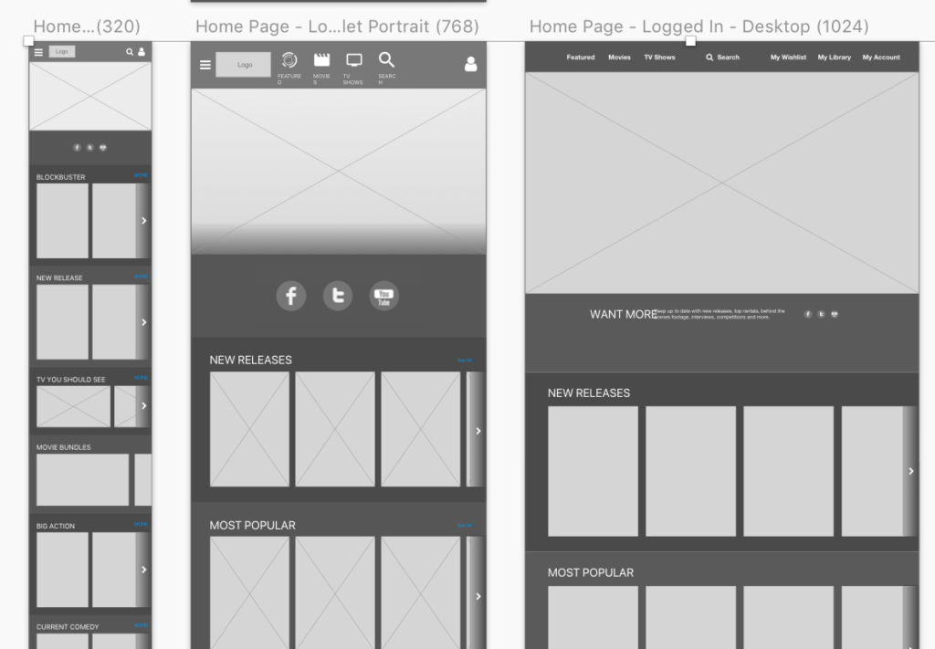
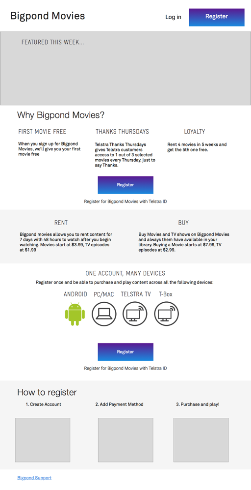
The Android app was already on its way (see my work on it here) and so the products team wanted to continue the good work my team was doing and so my team was tasked with designing the new Telstra TV app, along with the new website and registration portal.
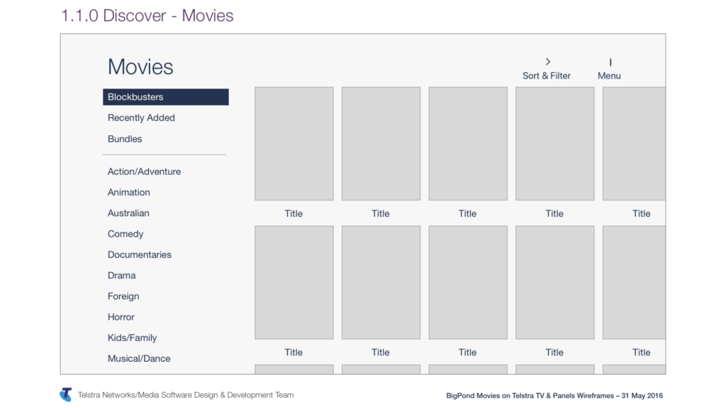
To the right and below you can see some designs from the Telstra TV, and across to the right is one of the designs from the registration portal (a website to sign up).
However I had to be the single point of consistency for UX across all the apps being developed at this time, which included:
Android (Phone and Tablet), Telstra TV (re-used on Smart TVs), Telstra T-Box, Website, Registration Portal (web) and iOS (phone only)
During the process, I was asked to draw up user flows for the entire app. I had all the knowledge, but not the time so one of our vendors was contacted to provide a resource for a couple of weeks to put together the flows. I simply provided the relevant knowledge and wireframes, and he put the flowcharts together.
This is an example of the full user flow from sign up to purchase for the BigPond Movies app on Telstra TV. As you can imagine, understanding and designing for such a complex application was no mean feat!
During this time, I was also asked to start putting together the wireframes for the new website that would be built in conjunction with the new set of BigPond Movies applications. At the time, there was a new brand coming into place, and they wanted the new brand to be reflected with a brand new user experience.
The key behind all this was that all the applications needed to be consistent, and so it made sense that I was across all the designs for all the applications.
