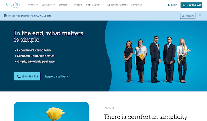
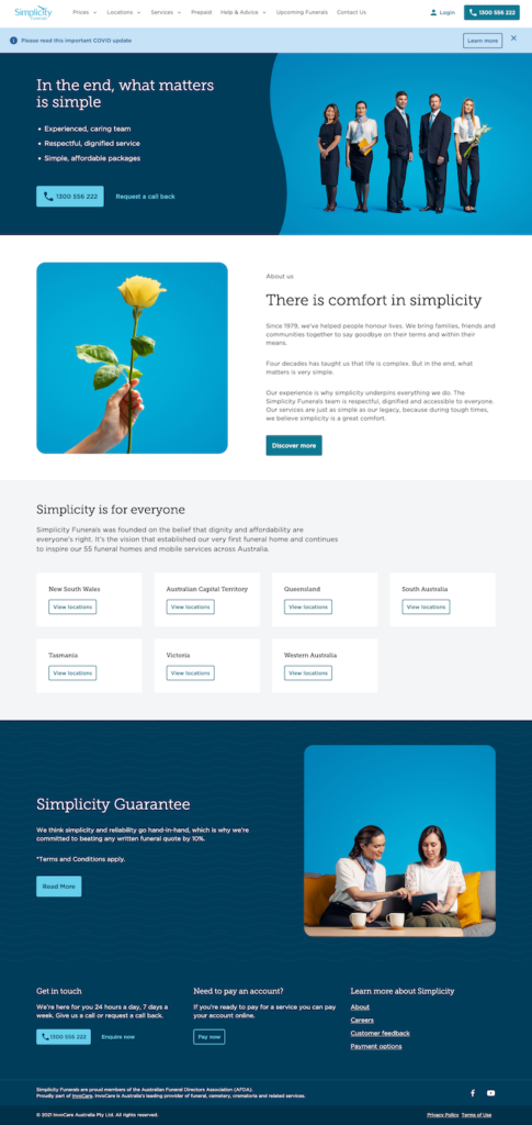
A new website had just launched for ‘Simplicity Funerals’ utilising a new design system developed by Merkle, however no usability or pre-launch testing had been done on this new website. This design system was intended to be a robust, extensible and themeable system, allowing for all
My role was to assist with the rolling out of this design system to other brands, while finding opportunities to implement a better experience
Background
InvoCare is a large Australian-based funeral provider, owning over 60 brands in the Australian market alone including White Lady Funerals and Simplicity Funerals.
I onboarded as part of the Web Accelerator squad, tasked with rolling out the design system to other brands, and uplifting the digital experience along the way.
The Opportunity
Exploratory Research
The new website had just launched for Simplicity Funerals utilising the new design system developed by Merkle, however no usability or pre-launch testing had been done. I requested access to Adobe Analytics, Google Analytics and HotJar, and I had access to many tools to explore the data to see how the website was performing.
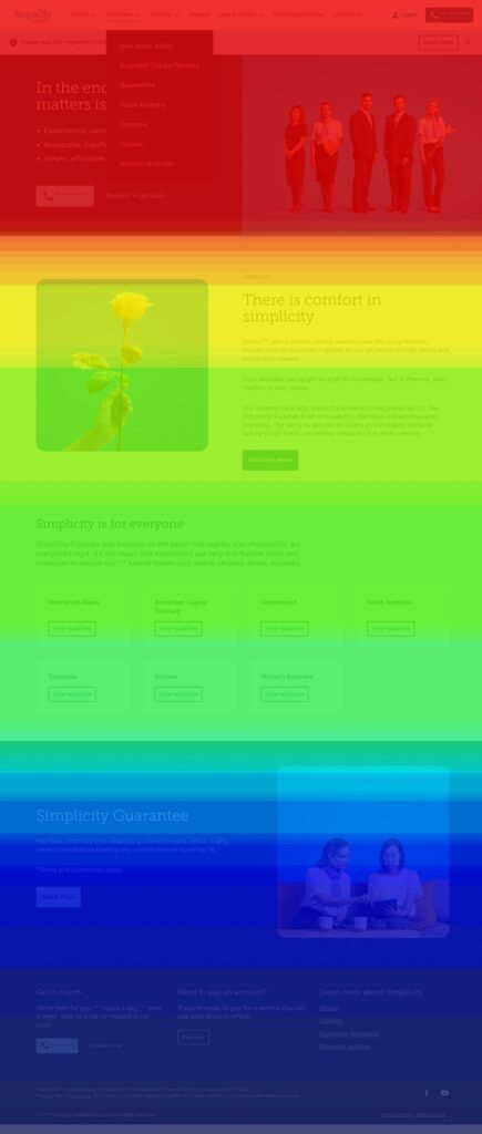
I took the opportunity to conduct exploratory research, navigating through user paths, most commonly viewed pages, and seeing if there was a clear funnel from landing to Contact Us, or if there seemed to be anything odd.
Needless to say, there was one odd thing. There was around > 80% bounce rate from the home page of Simplicity Funerals and the heatmap on the home page showing a majority of people didn’t scroll past the hero banner.
Usability Testing, insights and recommendations
I proposed usability testing to test issues on the new website, focussing on the issues highlighted on the home page.
The root cause of these issues were clearly identified, as were several points that the client had never considered from a digital perspective due to their lower focus on the digital aspects of the journey.
One example was: “Users don’t know where to start arranging a funeral..”. This was compounded with a known statistic that the majority of customers have never actually arranged a funeral before.
Action
Updates to Home Page + Information Architecture (IA)
These insights fuelled several design initiatives, prioritised by the product owners as being important.
The changes included:
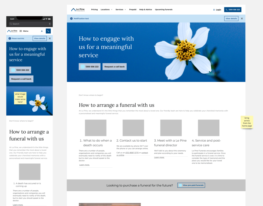
Pathway tiles on home
‘How to arrange’ section on home
Restructured IA with “Arrange a funeral” menu
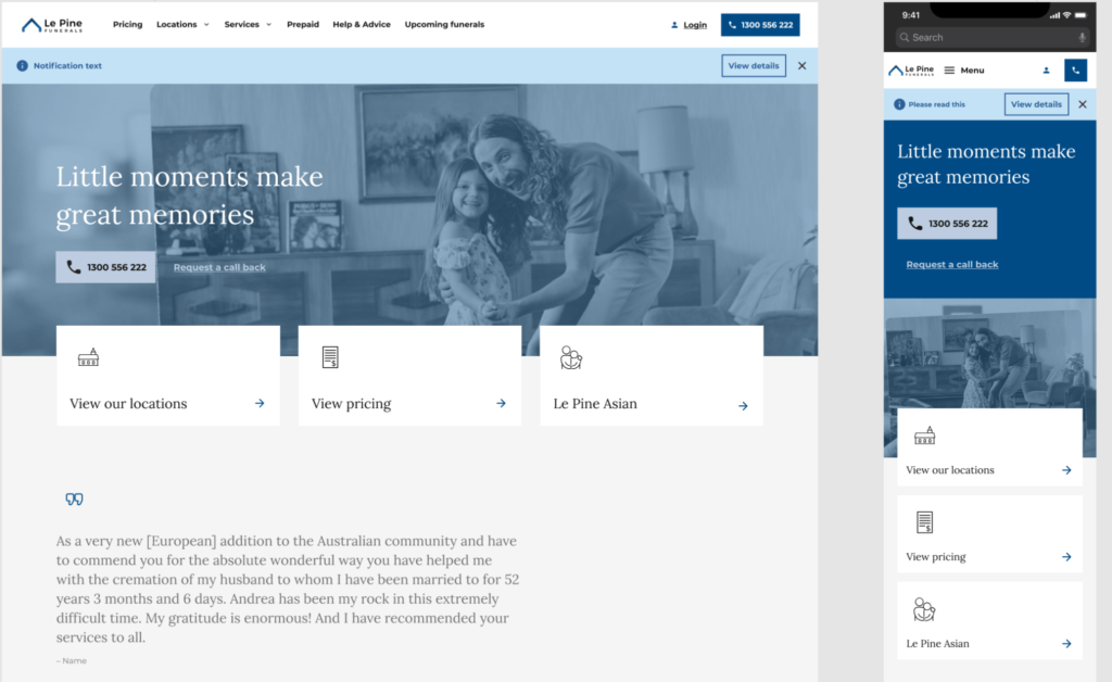
It was decided that the changes would be rolled out on Le Pine Funerals first, as it had lower traffic and could be used as an effective test bed.
WIP Wireframe version
Visual design with further refinement
Outcomes
The uplift on lead conversion was the easy proof point, which allowed this new layout to be carried across to other large InvoCare brands such as Simplicity, White Lady and Guardian Funerals.
Lead conversion rate on Le Pine Funerals from 1.2% -> 7.24%
Slowing the bounce rate from 80% -> 45%.
These changes have now been rolled out to many other InvoCare brands
Outside of the numbers, the big shift for me was being able to convince the stakeholders not only to do usability research, but also being able to implement a series of changes to improve the experience for customers.
Personal takeaways
The stakeholders initially thought the purpose of the website was more like brochure-ware. As the main experience starts “in-store” they expected the website to be for browsing locations and getting in touch.
What they didn’t expect was people wanting information upfront about the process and to be guided through arranging a funeral before speaking to someone.
I improved my interviewing skills, having to talk to people who had organised a funeral in the recent past.